Friday, 11 December 2009

I have just had a spring/winter clean of my laptop ready to get windows 7 and lots of nice new things, and it took me 3 hours. I find these pics from two London exhibitions that I have been looking for for ages! I realised they're rubbish pictures, don't know what I was doing with the camera, but they were both really great exhibitions so I thought I'd put them up. I'm sure there were more somewhere...

The Design Museum - Super Contemporary
London thinks, designs and makes like no other city; it creates and the world follows. A magnet for mavericks and freethinkers, London has nurtured a creative community that continues to rival all other design capitals. So, Design Museum joined forces with Beefeater 24 to celebrate the fearlessly progressive spirit of London's greatest creative minds, past and present.


I am sorry the pics were not better (not sure what an earth I was doing with the camera this day) because I spent about 4 hours looking round this one exhibition, it was one of the most interesting and informative exhibitions I have ever been too and I learnt loads.


The history of underwear at the Textile museum in London. A bit pricy to get in considering the size but it was good. I love timelines because I am such a geek and this one was really great- the history of underwear contextualised with important historical events concerning women, politics and design. There was some very old (1600's) and some very expensive (diamond encrusted chanel) under garments on display, some crazy totally impractical ones and some beautifully exquisitely designed pieces. I never realised how closely women's underwear and politics related!

P.S now I have windows 7 and CS4 and have fallen in love with my computer all over again =) Speedy Gonzalez!
Archiving time and place

I think I've gone blogging crazy lately.

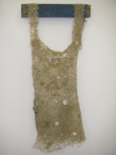
Here's some of the work in the 'archiving time and place' exhibition that I have been invigilating for the last month on Friday afternoons. The exhibition is by a number of Irish artists, exploring the conflicts in Northern Ireland. I haven't been particularly inspired by any of the work here - not that there isn't some interesting things here, but it just hasn't really sparked off any ideas. Still, here's some of the things I liked!


Conor Mcfeely- Disclaimer


Rita Duffy - Sleech (flags and human hair)


Conor McGrady - Silent forest


Rita Duffy - Dessert - Chocolate and linen with lace

Thursday, 10 December 2009

Interrogating the art school

Today I did a workshop with some school kids as a student ambassador with aim higher at university. There task was to 'interrogate the art school' and then they had the mac trolly and there creative skills to create a poster about everything they'd learned. Well it was pretty difficult to get 15 year olds to be enthusiastic about anything, mainly they were just uncooperative and difficult to get anything out of, but when we started on the posters, I realised they had learned a lot of stuff and they made some pretty good posters out of very little! Overall it was a pretty fun day!


Also I went up to the eight floor, which I have never been to before, and the view was amazing. These pics were taken by the kids but I'll be going back up there soon to get some more.


Silence take one


Yesterday I spent the day in the studio filming the first part of my silence film. I had some technical help from my boyfriend who luckily for me is a photographer, but it was a lot of trial and error.

I dropped each of the seven sets of letters in front of the camera about 20 times, but most of the time was spent picking up the tiny bits of paper off the floor. I haven't put the footage on the computer yet so I don't know if it has worked, i'm not technically sure we have the equipment at uni to do what I want to do, and if we do i'm not sure I'm capable of doing it... ha ha... so fingers crossed for the next stage!!!

Monday, 7 December 2009

Time is money

I have had numerous horrible jobs since I came to uni, the Student union, Debenhams, festivals, waitressing, and since I started doing the open days last year it has been the best job ever. Flexible, worth putting on your CV, good pay, and fun compared.

A few weeks a go I went to work at a UCAS fair in London, put up in a hotel for 2 nights and all food and expenses covered, then we did one in Manchester the week after. I've also been invigilating the shows in the Holdon gallery in 3 hour shifts which is amazing - get paid to literally sit there and do you work (and check no one tampers with the show). It's a great time to blog and I get to look at the exhibitions properly. On Thursday I'm running a school open day where we get to spend the morning making posters with the kids and get paid for it. All in all I think I'm pretty lucky to have such a great job. Although it's not directly related to design, I have had an insight into the marketing and design side at MMU and it's great people and presentation/confidence experience.

Which brings me to the original point of this post, in June after we broke up I worked at the degree show for the week. I admit I never really looked properly round the degree show before which is quite bad. I'd just wonder round the bits I thought would be interesting. However, as I had the whole week 'looking after it' I went everywhere, and looked at everything, in every nook and cranny. I discovered so much more! It was really inspiring as well, to be in such a creative atmosphere I was brimming with ideas and bought my sketchbook to scribble everything down. Here's some of the best things...


Alcohol Aware... ta daa

Hallelujah!

Finally I have found an idea, stuck to it and designed it. I came up with the 'spin the bottle' thought late last sunday night right before bed after many, many not so good ideas. I scribbled it down and went to bed.

Then I spent all week 'thinking' about the idea, how could it work? I just couldn't seem to start it off. I started to panic a bit that I wasn't going to get anywhere and with everything else going on it felt like everything was piling up! eek.

On Thursday I met with Anna Hartly (the only other person doing this brief) and very nearly jumped ship to her idea to work as a team I was so desperate (and her idea was so good). I calmed down after a while and realised it would be unfair at this stage for either of us to abandon our ideas and work together, so we decided to help each other and submit separate pieces. Anna helped me loads getting started with the visuals and finally on Friday I got somewhere.

Over the weekend and today I managed to produce my final concept and 3 boards for tomorrow wahhooo. I grabbed Liz for 5 mins to OK my concept - after working for the last two weeks with no feedback I was worried in case my idea was actually a load of rubbish, but luckily she liked it. I think there's a little work to do on perfecting the visual style, but hopefully not too much. Looking forward to finally getting some feedback so I can finish it off and hopefully send it in to YCN!


My final idea is an interactive billboard that would be at bus stops and on the streets. The digital poster invites you to 'spin the bottle' in the style of the apple i-phones/pods. As it spins round it would light up each segment until it slows down to a stop. The segment it lands on will reveal a negative effect of drinking that young people can relate too such as 'Bad skin' or 'Bad sports performance'. Each time you spin it could land in a different place, revealing a different answer. The poster would also offer a text or blue tooth service so that you could receive further 'tips and advice' of how to avoid these things to your mobile.

During my research and ideas in the first week, I asked Liz to ask her 13 year old son and his friends, and Stacie's younger sisters a few questions such as what brands they liked, what and where they spent most of their free time doing, which celebrities they looked up to etc. The research turned out to be really useful and I got quite a few answers I wasn't expecting. I realised that 13-16 year olds aspire to much more sophisticated brands and therefore visual styles than I wouldn't have expected. This really helped me in my ideas development - I definitely would have had a very different visual outcome.

I have also developed the idea across Facebook and YouTube and a direct mail piece. I know I still have a little bit of work to do on this, but I am actually really pleased I kept at it and persevered with this brief (There was a point when I was considering changing briefs it was all going so wrong). For once I have finished something that I'm pleased with for the pin-up!

Worth talking about...

The new advert aimed at teenagers about contraception (the one with all the speech bubbles) was done by the agency I did my work experience at over summer. The last week I was there I sat in on a brief presentation of ideas from LIDA (The direct marketing agency of M&C Saatchi that I was working in) and M&C Saatchi themselves and saw the very first sketches and mock ups of this idea. At this stage they were still quite illustrative and for much longer conversations, but I guess the visual style was pretty close to the finished piece already. After ideas, the TV production went of to Saatchi's and the website was designed by LIDA. It was funny to see the way the two agencies worked together - one evening the creatives in my office waited until 10' 0 clock at night to get Saatchi's decision on a typeface before they could even start working on the website mock ups for a presentation the next day. Crazy. I'm not sure about the final website, I think it could have been a lot more interesting visually than it is. I wasn't sure in the first place about the idea - whether or not it was strong enough to actually reach young people? I don't know if the choice of media is right either. I think the final things are OK...hmm, nice, but that's as much enthusiasm as I can muster up. Just don't think it has enough impact or reach to get such a difficult target audience to pay any attention to such a difficult subject. Then again, maybe I am wrong!

The Tv ad:
http://www.youtube.com/watch?v=AGZ33Bu1Y7s

The Website: