Thursday, 22 April 2010

Love Creative

Today I had my second portfolio crit with Love Creative and the creative director Phil, and Chris Myers, another creative. I have been waiting for this opportunity for a long time, as Love are number one on my list for a placement when I leave. I have been aspiring to work like theirs ever since we were given the little brown velvet books in first year.

After a crazy rush to print one last sheet off of work that i'm doing right now (broken hard drives and forgotten cables meant a very late noght and early morning), I turned up at their office nice and early. The office was exactly like I anticipated, full of lovely things and funky furniture.

Anyway, back to the important bit! Phil and Chris were really friendly, so we got off to a great start. They flicked through my book while I talked about each project. I felt like we got a good conversation going and had a lot to talk about. They were very positive about my work and liked my book a lot. They commented on the fact that my panic and silence briefs were very random, but I explained this was the nature of the experimental and open briefs and they said the thinking behind them was still interesting to see. Chris really loved the idea of my Stonewall brief (which incidentally was the one Jonny Hardstaff commented on as weaker) although he advised that I could re-present the postcards using photographs instead of the drawings now that I am not restricted by the copywrite rules of the brief.

What I realised overall (apart from how nice it is to be praised) was how important it is to stick with the work that you feel confident with - just because one person doesn't like it doesn't mean another person won't love it! It gave me confirmation of which briefs to keep in and which to take out when it comes to leaving with my book in June. I know what kind of work I want to do and I need to reflect this as much as possible, but without compromising the variety and range of my skills. There is always my website to display work which doesn't make it into the book but is still relevant.

As Chris closed my book, he commented that it wasn't really a design portfolio (which was a good thing for them), and I was pleased with this as I do not call myself a designer and I do not want to be a designer!

New Brief!

Over Easter I embarked on a research project which is to form the basis of my new brief about voter engagement in young people. I decided I wanted to write my own brief this time, so it was important to make sure I got my head round the situation so I could write a brief that was not going to fall apart when I started working on it.

I decided to put this research into a book, partly because it's a big part of this project, and partly because I wanted to leave uni with some research that I can show to people to show that i'm interested in and capable of working on all sides of the brief. I wanted to take the research out of my sketchbook just to keep it as clear and easy to understand as possible and not get caught up with all the cutting and sticking and scribbling that makes a sketchbook much more personal.


Here's the new brief that I have come up with, which I will be working on now until the end of term!

Brief: Voter engagement in young people

Background:
18-24 year olds have the lowest recorded voting numbers of all, and each year they are declining. There is a general feeling of disillusionment amongst this age group and a disdain from older audiences towards them for not voting. With the approach of the 2010 general election, it's important to re-engage youth and remind them how important it is to vote.


The Brief:
To create a full campaign that encourages young people to actively get involved in politics during the election and re-animate their interest. These include:

Lack of understanding and unbiased, accessible information and comparisons between parties
Feeling like your vote won't make a difference
No faith in the government

Target Audience: 18-24 year olds across a wide range of students, professionals and unemployed.


Aims & Objectives:
To challenge young people to think about what their vote means
To address the target audience in appropriate media
To actively engage young people with the voting system

Wednesday, 21 April 2010

Emily Forgot

Emily forgot A.K.A Emily Alston is a Graphic designer come illustrator who works in London. She graduated 6 years ago from Liverpool and is now a successful freelancer! Fingers crossed I can hope to be as accomplished and connected as she is in 6 years time!

I really enjoyed looking at Emily's work because it was so surreal. She has very distinct and recognisable styles which included simple minimal drawings to very detailed images. I particularly liked how surreal her work was and the use of colour, her work felt quite dark and always visually stimulating. She talked about how she was inspired by the likes of Aldridge and Koon and was openly honest about what she liked and how she always tries to get something random into a piece. She particularly likes juxtaposition in her work, something I have always been into myself.


With Jobs like Selfridges window displays and Creative Review covers, Emily has definitely made a name for herself in the industry and I'm sure her success will only continue.


Emily talked a lot about life after university, missing the facilities that we have access to when we're here, being put into a box and always getting asked to just repeat your 'style' for a different client. I totally related to what she said about being in London - it's not that the city itself inspires you but that you feel like your in the middle of something and it's easier to get into those circles and meet the right people. Something that really stuck with me is the idea that your personal work can help influence your commercial career. This is something I intend to keep in mind, I don't expect to be able to work on the briefs/clients that I want to immediately but keeping up a personal portfolio should help to remind people what I want to do and what I am capable of.


I got these images from Emily's website, and while I was visiting it I noticed she had used the same simple format to build hers as we are doing in our workshops with Chris. She actually has a very similar design to mine that I have been laying out recently - the thumbnail portfolio that links to the work and use of black lines will be appearing in mine soon! But it's good to see that this will work and that you can build a website simply and yet still have a very effective tool to promote yourself. Watch this space for my new website which is currently in the middle of two designs (after spending ages on it I totally changed my mind and am revamping it already)!

Tuesday, 20 April 2010

Self Promotion


For ages I have been thinking of an idea for my self promotion. I didn't want to do a logo as that is not one of my strengths in design, my initials are a bit boring to work with. I was having difficulty thinking of something that represented what I do and how I want to be seen out in the real world, when I finally thought about this idea. I wanted to get across that my work relies heavily on research and concepts, that I enjoy all aspects of a brief from the beginning to the end and I can turn my hand to many different things. Hence Left Brain Right Brain! This shows two different sides of the business card, reflecting different sides of the brain. And there was the added bonus of it looking like a speech bubble!

I am really pleased with this idea and design, which i'm going to put across my website, portfolio and CV. I'll be sending these to John in the Litho print before the degree show!

South Killingholme


I deliberated for the last week on what to do with my images that I took of my home village. I was going to make a book, but thought I'd just be doing that for the sake of it, so I decided to make this poster. There is no rhyme or reason behind this mini project, it's an extension of Britishness and directly inspired by the Caravan gallery. I personally like the use of the photos here, I think the shapes enhance them. I chose the type face because it looked industrial and the shapes reflected the shapes of the landscape.

Well I don't think i'm going to take this any further, but I do like the outcome. I might tweak the poster design a bit. I do think when you look at the photos they tell you a lot about the area and my village, and if you look closely the photos are interesting and well juxtaposed. Liz didn't have much to say about it - I think one of the other tutors might have appreciated it a bit more. Needless to say I have achieved what I set out to do!

Sunday, 18 April 2010

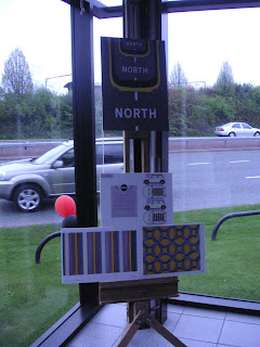
Mini roof design!

Today was the big results of the mini competition design that Stacie and myself entered. There were numerous entries but due to a mix up of where to send them, only ours and another girls were displayed in the show. All the entries were still judged though, and were announced as being in the top two. Sadly we didn't win, which I was pretty disappointed about, but we did get loads of free mini stuff including a mouse, usb stick and notebooks and free mini cakes.


The girl who won was a 3rd year embroidery student, whose idea was based on road markings. I may be biased, but I thought our design was much more original and interesting than her's, but she did present it better which I think is what swung it for her. Rooky mistake on our part that we didn't present the work as a mock up and put our explanation at the front (it was on the back), I was a bit angry with myself that we didn't - just slipped our minds being so busy with everything else - it would have been an amazing opportunity to win! However, I consider myself well and truly taught my lesson that I will not forget soon - always make sure your work is presented in the very best possible mannor! A good lesson to have finally sunk as we loom closer to the end.

I will be re-doing the presentation complete with mini mock ups for my portfolio!