Friday, 27 November 2009

Craig Oldham


Craig only left uni 3 years ago - he has a great job at Music and has worked in some great agencies already (including Chase), and he still remembers what it's like to be a student.

There was lots of nicely presented pearls of wisdom in his talk.

Two heads are better than one. They just are.
15,500 design students graduate every year.
Rules should be broken but never ignored.
Being an artist gives you liscence to hoard stuff.

But what was really great about Craig's talk was his openness and personality, they really shone through. He had a genuine enthusiasm for motivating students - taking time out of work to give these lectures and even producing a newspaper of everything he told us!

The most interesting thing, that struck me the most, was what he said about ideas. When someone comes up with an idea in just a few seconds, its those few seconds,plus their whole life. Everything you have ever experienced, learned, collected, stored is dredged back from your memory and you file through it for anything relevant to what your doing. This made perfect sense to me, guess I have just never thought about it before. That's why everything you do makes you a better designer. This is what I like about designing the most.

''Understand what graphic design is to you. Define creativity, and what you value as good design, then you'll know what it is to achieve it''

Wow, this is a really inspiring quote. I think i'm a more 'bunch b' emotional designer, but I do have quite an influential logical pull as well. What I do know is that I've stopped trying to put myself in a box now - I don't want to be an 'advertiser' or a 'graphic designer' or an 'art director', I want to be a creative. And I want to use my creative skills to do anything that comes my way. And I want to work with people, and not by myself. The bit about knowing your strengths and weaknesses - I think I work better in a team, but most of all I enjoy working with people more than working by myself.

On his website, the design family tree, something I felt I could really relate too. Before I did my placement in summer, I was terrified about leaving uni. I kept thinking that I really had no idea how I would begin, and what I would do when I left. The outside world seemed so far removed from the little university bubble. But when I came back from London, I actually tried drawing out something really similar to what Craig had done, like a flow chart, because I really needed to express the little journey I went on somehow. I realised that once you meet just one person, you meet someone else, and then get invited to something different, which leads to meeting another person and it really does happen. Now I've had a taste of that, I'm not so worried about leaving, i'm just excited about what might happen.

When I got home I read the paper word for word, and it was great. I love the pull out wall chart with little reminders on it. Then I went on Craig's website and I now I love him even more! I love how his website is so personal, the 'to do' list is exactly like one I have made myself, but guess I would never have thought to put it on a website - Do I want to be a designer all my life, write a novel, read every book I own. I like how he's still doing his own work and uploading it along side the paid stuff. I like how much of it is just chasing ideas and satisfying curiosities just for pure pleasure. I actually think this is one of the best self promotion websites I have ever been on. I feel like I know Craig so well.

I think this was one of the most inspiring lectures we have had so far, and if in 3 years I can be any where near as sorted as Craig I will be a happy chappy!!


Museum of Art and Design (MAD)

We went to the MAD on friday evening, 'pay what you wish' night, and we only wished to pay a few dollars each so saved a lot of money there! There was 4 floors altogether:

Random floor - can't find the name of this exhibition, it might have been a permanant collection. Quite a mix of things, mainly 3d like furniture and objects. Here's just a few things that caught my eye!

Bobby Silverman - stacked bowls with vase
Jin- Sook So - Steel mesh

Kondo Takahiro - Blue Mist Object

Ghost Stories
On the first floor there was an exhibition called Ghost Stories by Nendo designs. The main space was completely white with just these wooden chairs dotted around. They appeared to be floating as their white legs disappeared into the floor.

Then there were these strange bubble type things that looked like they were pockets of material blown up, but were actually hard material. I liked the fabric texture and look to them, they were very delicate and the lighting made them kind of beautiful.


Slash - Paper under the knife
Upstairs the main event across two floors was the Slash exhibition - every artist and every technique you can imagine ever applied to paper. Some of these things were truly incredible, I really appreciate detail and when it is painstakingly obvious how long and how much skill went into a particular piece of work, so I wasn't disappointed.


Adam Fowler, 74 layers. This was one of my favourite pieces. I liked it because it was more original than some of the others, the depth and detail to it amazed me.


A large scale piece by Andrew Scott Ross with tiny cut out men and animals like a secret world!


Ariana Boussard Reifel - Between the lines. Another one of my favourites, this book started life as a violent and racist white supremacist book.


Georgia Russell - The story of Art


Beatrice Coron


Brian Dettmer


Rob Ryan - Can we, shall we. Possibly one of the most famous paper cut out artists, it was really different to see his work in real life it was so fragile I was worried about it ripping just looking at it!

Carole Kunstadt


Chris Gilmour - Triumph of good and evil


Daniel Alcarla


Dylan Graham


Ed Pien - Night Gathering


Beatrice Coron - Heaven and Hell. The 'Hell' piece was on the lower floor against a tall window, then directly above it on the floor above was the 'Heaven' piece. Nicely exhibited!


Jane South - Wall


Judy Pfaff - Bougue Lusa


Kako Ueda


Mia Pearlman - Inrush


Sue Blackwell - Rapunzel


Tom Gallant - Rose window


This would have been a great exhibition for anyone now doing the paper brief. Personally paper playing is not really my thing, and I do find a lot of these artists a bit repetitive and indistinguishable from each other, but every so often there was one that blew me away so it was a good exhibition over all!

The Neue gallery

The puling factor to this gallery was the Klimt work on display - One of my favourite artists of all time, and ever since I missed the exhibition in Liverpool I have been desperate to see some of his work for real. There was some other stuff along the way, including some nice posters and drawings we saw.


Berthold Loffler - Poster for the art show Vienna


Klimt - 1st Succession poster.

Berthold Loffler


Erich Heckel - White horses


Lyonel Feininger - I never heard of this artist before but his work has a really beautiful aesthetic and style to it.


Koloman Moser


Otto Mueller - I was strangely drawn to these drawings by Mueller, I don't know why but I really liked them.


Max Openheimer - I loved these paintings as well, very unique and quirky style to his portraits.

Leopold Stolba


Aah the Klimt - Adele. Seeing it in real life was better than I expected. The colours were a lot duller over the years than any of the prints you see, including this photograph, I guess they are always enhancing them. It also looked completly different, I always think of Klimt's paintings as kind of flat, as though the people have been rollered over or something, but only when I stood back from it and it was so big did I notice the fact she is meant to be sitting in an arm chair - I just saw it as pattern surrounding her before!


The Dancer

It was a shame that there was only two of Klimt's famous paintings up, I was hoping there would be more, but there was also loads of drawings and sketches he did which were really beautiful. You could see similar shapes and poses coming out in them as ended up in the paintings. Unfortunately we couldn't take pics and I can't find any online!


Alfred Kubin - Beautiful, but never the less, quite disturbing drawings.

Cooper-Hewitt museum

Two exhibitions here as well:
Design for a living world
Ten leading designers have been commissioned to develop new uses for sustainably grown and harvested materials in order to tell a unique story about the life-cycle of materials and the power of conservation and design.

What I particularly liked about this exhibition was the layout/set up of it. All through the space giant photographs were printed on these recyclable steel sheets, all hung from wooden frames across the walls to create a large montage. Printing on the metal gave them a really gorgeous texture and sheen. It was nicely lit too.


Ezri Tarazi


Christian Meindertsma - sheeps wool

I also learnt a lot of random facts such as:

Bamboo produces more oxygen than trees, it can grow up to 50m tall, as fast as a meter a day, and it regenerates itself so you never have to replant it! I thought that was pretty amazing, when I have my own garden i'm going to have some bamboo in it!

You can make leather out of any kind of skin - and salmon leather is really good apparently. I have no idea why I didn't know this before, maybe just never thought about it. You could make human leather...


Design USA: Contemporary Innovation

'Not everything is design, but design is everything'

I havn't found much work that was actually on display in this exhibition online, but I scribbled down a lot of names and have been looking them up. Here's what I discovered:


Orla Kiely


Designer Chip Kidd lives in New York. I hadn't heard of him before but found this website about him. He designs a lot of book covers and some quite nice ones too.


Micheal Bieurut - A designer who works at Pentagram. Above are some poster's he designed for Yale University. He also wrote a book I wanted called '79 short essays on design' which I'm still hoping I can find in the library!


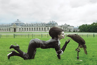
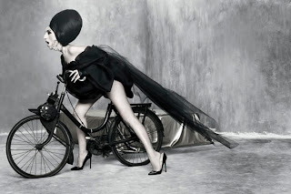
Photographer - Josef Astor. His photographs have a big surreal element in them. I love fashion photography, think the two arts go so well together, but so often, especially in magazines and advertising, it is so generic and boring. Why can't magazines be full of amazing concepts and art direction in their advertising as this!

I not only discovered one, but two great photographers at this exhibition, both who have done some amazing fashion stuff - below is also Ruven Afandor.


'Liquid architecture' - Ned Kahn - wind silos.

''Covered with 80,000 small aluminum panels that are hinged to move freely in the wind. Viewed from the outside, the entire wall of the building appears to move in the wind and creates the impression of waves in a field of metallic grass. Inside the building, intricate patterns of light and shadow, similar to the way light filters through the leaves of trees, are projected onto the walls and floor as sunlight passes through this kinetic membrane.''

I like architecture as much as the next person - I appreciate it but it's not something I really look out for. This building amazed me though - just the description of the website of it is magical, imagine what the real thing would be like. All Kahn's work seems to be inspired by the natural elements, he creates buildings that mimic, reflect and interact with the very beauty of it.


Bill Moggridge - Pioneer of interaction design, designed the first lap top computer.

Stephan Sagmeister:

Have seen this work so many times, but never for real so thought I'd put it in!

Milton Glaser:

In the exhibition, some of the artists on display were linked to videos and extra information you could get from an ipod (which were free to take round with you). This interview of Milton Glaser was especially inspiring.

''Social commentry is part of the process of design. If you have the ability to transmitt messages, then they should do no harm''

''If you lose your capacity for astonishment - that is terrible''