Friday, 21 May 2010
Final project research: voter engagement
My final project is based around voter engagement in young people. Inspired by the recent elections, I kind of wish I'd got round to this before the general vote, as I have been researching and planning this project since before Christmas, but never the less, this will be the final cherry on the cake to complete my portfolio. I have a couple of strong ideas already, which I will spend the last two weeks executing, but both are quite visually difficult to bring off so I have been looking to get as much inspiration as possible! Here's some new research, some old research and some lovely ideas!
Labels:
Political project
Website
As we only have two weeks to go today (Eeek!) I am starting to think about rounding up all the little things that need to be done. I still have two projects to round up (slash do) but fingers crossed should have plenty of time to finish.
One big task was my website, which has needed finishing for a while now. It's taken quite a while, and been through 3 different design over haul's, but now it's finally ready! See it here. It took me ages to sort out all the images and decide what to put on there. I've still got a couple of projects to add and there's a few design tweaks I'm having trouble with (main image needs to be centred, more of a margin between the menu lists and borders etc) but I will have to wait for some trusty advice from Chris for that. In the mean time I finally have a respectable website as a result of the web workshops with Chris which I am very happy with! These workshops were one of the best things about this term, and I'm so glad I was given and took this opportunity in the end.
One big task was my website, which has needed finishing for a while now. It's taken quite a while, and been through 3 different design over haul's, but now it's finally ready! See it here. It took me ages to sort out all the images and decide what to put on there. I've still got a couple of projects to add and there's a few design tweaks I'm having trouble with (main image needs to be centred, more of a margin between the menu lists and borders etc) but I will have to wait for some trusty advice from Chris for that. In the mean time I finally have a respectable website as a result of the web workshops with Chris which I am very happy with! These workshops were one of the best things about this term, and I'm so glad I was given and took this opportunity in the end.
Labels:
other work
Thursday, 20 May 2010
Fairwell journal!
This year I decided to approach my journal differently. It's the first year that I really felt like I understood exactly what it is they were looking for. After seeing Libby's journal and that she got 85% for it, I felt this was a great opportunity to pick up marks and as I really enjoyed doing it, that's a bonus. I decided to tackle the journal as more of a brief, a design problem. Although they said that they don't mark design itself, this is what we do for a living so I think it's important to make it look nice, and as it's the last year I wanted something I was proud of and could keep.
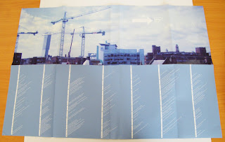
So, most of my design decisions were based around making it accessible and as easy as possible to navigate, highlighting the links between different things. I did separate bitesize books for each section, with titles down the edge of the pages so it could be 'flicked through'. Then I used fold out pages so that I could show the key points clearly, meaning the tutors don't have to read the full write up to see the significance of that topic, with the in depth writing underneath.
As my cover, I decided to use an image I took from the studio, which is where I've spent most of my time this year and also to represent getting out into the big wide world. I designed a rating calender overview type thing of the whole year also on the poster for a quick summery that could be folded out and viewed alongside the books to help contextualise the year.
I have put a lot of work into this journal, going all out for the final year, but was careful not to neglect my other work or spend too much time on it. However, the journal is worth half of our practical work this term so I think it's worth the extra effort! I think I might even miss doing the journal when we leave, dare I say it!

Labels:
other work
Monday, 17 May 2010
Google Chrome
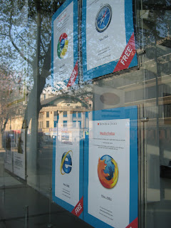
This has been a very drawn out project for me. One that I started researching at the beginning of the term and intended to finish for the YCN deadline in March. I've actually had this idea since then but for some reason I've found it impossible to execute it and it's taken ages for me to decide how to display it. Because it was an idea that was really a proposal and also was based a lot on the copy I wrote for the adverts this made it very hard! Eventually, I realised that the best and only way to display this in my portfolio was to actually do it. I went to Homes 4 u on Oxford Road and asked them if I could stick my adverts up in the window. They thought it was very strange and couldn't quite understand what I was doing but I managed to persuade them to let me, only if I turned up at half 7 when they opened.
However, this was definitely worth it as now the idea is much more bought to life for my portfolio and it really shows off my idea in the best light. I'm glad to have another advertising brief in my portfolio for when I leave, and this one is a little different from the normal., but stuck very much to the brief. Overall, I'm really pleased with how this project finally turned out, now I'm just in the process of designing a sample of the website which the 'Browser and choice' shop window is directing viewers too!
Labels:
google chrome
stamps- finally finished!
Here's my final stamp designs for the stamp project. They've been finished for ages now but not had a chance to update blog. Thought I better get started before we hand in the journal and they (hopefully) start taking into account the ongoing work gone into this as part of that unit!
In the end, I decided not to go for the whole 16 stamps as it would have become a massive project for me and this is never how I intended it. After discussing this with Liz in our tutorials I thought it was best to go for variety and sticking with just 4 designs would have the most impact. I have really enjoyed this project, and although I was worried at first that I hadn't done as much as I could with some of the amazing images I took, I was careful not to create stuff just for the sake of it.
I've also made a little animation using the photos which is not quite finished yet so watch this space!
Labels:
rsa Stamp project
SEA
On Tuesday we had a talk from Bryan Edmondson from design agency SEA. I didn't think I'd heard of them before, but I recognised the book they'd produced with the metallic logo on the front.
Founded by Bryan in 1997, he described the company as pure and simple graphic design. I spoke to him after about the short amount of time between graduating and setting up his business, just 5 years. He said he felt they'd started to early and as a result had to learn a lot as they went along at their own expense. This was an interesting viewpoint, different from everyone so far. Although I appreciated what he said, I guess I wouldn't mind making mistakes at my own expense if there wasn't any job to be had anyway!
Anyway, moving on... I don't really have much to say about this lecture, the work was lovely, although not really my thing and he didn't really give us anything else other than his work. So here's a visual feast of Sea Design!
Labels:
Lectures
Subscribe to:
Posts (Atom)


