Tuesday, 6 April 2010

Ireland, Scotland, Wales


Sneak peak

Just before Easter I did the photoshoot I planned for part of the RSA stamp brief. When I began this project it was supposed to be quite a quick brief but it turns out I've found a lot to do and got a little side tracked. Consequently this is going to form part of one of my bigger projects to hand in in June.

Below are a few of the images we took. I had the help of a photographer and two lovely actors from the drama department. This was a great idea of mine and I'm really glad I went to the trouble to find these people as I think it adds a completely different dimension to the shots which I wouldn't have been able to achieve without their brilliant acting/photography skills or someone from our course whose face we all recognised.


Anyway, the shoot was a real success. I really enjoyed art directing, working with such a professional team was a real experience for me. These photos still need a bit of editing, but the raw expressions and quality is in there. A lot of importance lies on the cropping, particularly for the stamps, but I'm also going to make some animations, postcards and posters with them. Watch this space for Scotland, Ireland and Wales pics to come!

Blooming lovely

I made these cards for easter as I was really to poor to buy easter eggs for everyone =)

Come on spring weather, where are you!?

Monday, 5 April 2010

Jane Eyre

I am a sucker for romantic old stories. After reading Wuthering Heights in the summer and being totally shocked, I found Jane Eyre by another one of the Bronte sisters in a charity shop. What always surprizes me about stories from this era, especially those by classic female authors, is how modern they are. I guess that’s why they’re classics. Granted, there is no sex involved, which most people these days see as the sign of a good story, but these novels are so full of love, passion, scandel, heartache, betrayal and violence, it more than makes up for it. Once you get past the some times flowery language, really the heart of the books is just a good story that is what most modern day rom-coms and chick lit are based on! This book wasn’t as shocking as Wuthering heights, which completely caught me off guard as I did not expect it to be so gritty and gruesome, but I still couldn’t put it down. Now what I would really love is for some modern directors (namely my favourite, Baz Luhrman) to get their hands on these books and make them into incredible films Romeo&Juliet/Moulin Rouge stylee, which really revive them for a modern audience and bring out the raw genius of the writing!

Friday, 26 March 2010

Alan Fletcher

Apologies for the terrible picture quality.
I'm going to skip the big write up as I don't what to repeat what everyone else has said. I will instead tell you the three things that struck me the most from his work.

1. A life's work - how many graphic designers have come and gone and left such a mark on the subject and influenced so many people? This was a massive collection of work, and i'm sure just the top of the iceberg. I really enjoyed how the range of work was everything from corporate pieces to personal projects for his Grandson. I felt this was a fitting tribute!


2. The work itself - If you hadn't known this work was all by the same person I don't think you could have guessed. There was no distinct style that defined Fletcher. I felt that some of the work could have been produced yesterday and no one would question that- he seemed a designer that was always one step ahead of the trend and you can literally see his influence cropping up again and again in contemporary design. You realise that nothing is completely new or original - it has all been done before.


3. I also really loved that Fletcher had put his great design and ideas to not only epic projects, good causes and big famous design agencies, but also how they had been applied to very commercial and boring brands such as tires. I have to admit when I was on work experience in London I found it very difficult to be creative with such limited brands and strict guidelines of things like H.Samuel and DHL, but Fletcher's work shows that with the right client and brand and an open mind, good design and thinking can be applied to anything to make it a better product and experience for the consumer. These are the people I want to work with in the future!


YCN

I have spent most of this week preparing for YCN to send it off via uni for free. Wednesday morning was very manic but I managed just about to mount my boards! I entered two briefs - the Alcohol Awareness project from term 1 which I have had a lot of great feedback for, and also work I did for Google Chrome Brief. I wasn't 100% happy with my visuals for this project, I've been working on it since the beginning of term intermittently but haven't actually spent much time on it. I finally came up with an idea at the weekend and madly tried to execute it in time. My gut instinct tells me my idea is really strong - maybe that will be enough - but I feel I have a bit more time and care to put into developing the brief to make it portfolio worthy. This will be another task for over Easter so watch this space!


Google Chrome:
The brief was to educate and promote browser choice to the wider public. It was open to any media and actively encouraged to be different.

My idea was based around the amount of time people spend in their browsers a day (on average 5-6 hours) and the fact they should be comfortable - the browser is your internet living room so to speak. So, I wanted to encourage people to shop around for your browser and find one that suits you, just like you would shop for your furniture or home. I designed a fake estate agents called Browser & choice to bring this idea to life.

I feel the branding of Browser & Choice needs to be worked on first - I need to find a line between an exciting/eye catching/ engaging design and something which has the traits of an estate agents and conveys the humour in the idea. A tall order! Once I have done this I will be able to apply it to all my avenues - the website, installations/exhibitions, strategically placed 'For Sale' signs and direct mail/posters, which will make it a much more credible and all round campaign for my portfolio.


Alcohol Awareness:


New School print making

I went to take a look at the Print making exhibition last night to see how they'd used the space. It was good to see it completely open, unlike the previous Talc exhibition that covered a lot of the floor space. Myself and Helen realised we're going to have a lot of work to put up and little space, but I think the space will look great filled with work top to bottom.


Print seminar

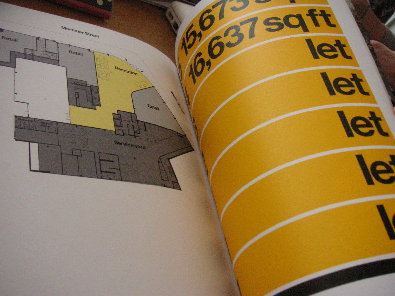
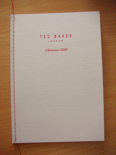
This was a very nice way to spend an hour handling all these lovely specimens. Below are a few of my favourites - I seem to be attracted to the simplest minimal designs and full blown images. I'm taking these traits into consideration for my journal design which will be taking place over Easter amongst many other jobs!




What did I learn?

Saddle stitch: is used on a double spread
Duplex: two pieces of card or paper stuck together to make a more rigid design usually used for invites.
How to approach a print job: Make sure you give a detailed spec of the piece including a title, format, size, stock, finishing, quantity and deadline.
Many print companies will be happy to help out students by doing free test runs and samples etc.

I'm going to have a go at some business cards over Easter, and will definitely be making the most of the discounted litho printing at uni for them and maybe a few final pieces!