Two exhibitions here as well:
Design for a living world
Ten leading designers have been commissioned to develop new uses for sustainably grown and harvested materials in order to tell a unique story about the life-cycle of materials and the power of conservation and design.
What I particularly liked about this exhibition was the layout/set up of it. All through the space giant photographs were printed on these recyclable steel sheets, all hung from wooden frames across the walls to create a large montage. Printing on the metal gave them a really gorgeous texture and sheen. It was nicely lit too.

 Ezri Tarazi
Christian Meindertsma - sheeps wool
I also learnt a lot of random facts such as:
Bamboo produces more oxygen than trees, it can grow up to 50m tall, as fast as a meter a day, and it regenerates itself so you never have to replant it! I thought that was pretty amazing, when I have my own garden i'm going to have some bamboo in it!
You can make leather out of any kind of skin - and salmon leather is really good apparently. I have no idea why I didn't know this before, maybe just never thought about it. You could make human leather...
Design USA: Contemporary Innovation
'Not everything is design, but design is everything'
I havn't found much work that was actually on display in this exhibition online, but I scribbled down a lot of names and have been looking them up. Here's what I discovered:
Orla Kiely


 Designer Chip Kidd lives in New York. I hadn't heard of him before but found this website about him. He designs a lot of book covers and some quite nice ones too.
 Micheal Bieurut - A designer who works at Pentagram. Above are some poster's he designed for Yale University. He also wrote a book I wanted called '79 short essays on design' which I'm still hoping I can find in the library!

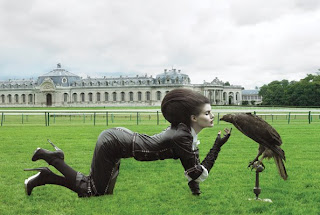
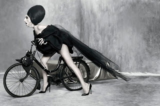
 Photographer - Josef Astor. His photographs have a big surreal element in them. I love fashion photography, think the two arts go so well together, but so often, especially in magazines and advertising, it is so generic and boring. Why can't magazines be full of amazing concepts and art direction in their advertising as this!
I not only discovered one, but two great photographers at this exhibition, both who have done some amazing fashion stuff - below is also Ruven Afandor.
''Covered with 80,000 small aluminum panels that are hinged to move freely in the wind. Viewed from the outside, the entire wall of the building appears to move in the wind and creates the impression of waves in a field of metallic grass. Inside the building, intricate patterns of light and shadow, similar to the way light filters through the leaves of trees, are projected onto the walls and floor as sunlight passes through this kinetic membrane.''
I like architecture as much as the next person - I appreciate it but it's not something I really look out for. This building amazed me though - just the description of the website of it is magical, imagine what the real thing would be like. All Kahn's work seems to be inspired by the natural elements, he creates buildings that mimic, reflect and interact with the very beauty of it.
Milton Glaser:


In the exhibition, some of the artists on display were linked to videos and extra information you could get from an ipod (which were free to take round with you). This interview of Milton Glaser was especially inspiring.
''Social commentry is part of the process of design. If you have the ability to transmitt messages, then they should do no harm''
''If you lose your capacity for astonishment - that is terrible''


No comments:
Post a Comment