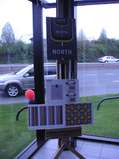


The girl who won was a 3rd year embroidery student, whose idea was based on road markings. I may be biased, but I thought our design was much more original and interesting than her's, but she did present it better which I think is what swung it for her. Rooky mistake on our part that we didn't present the work as a mock up and put our explanation at the front (it was on the back), I was a bit angry with myself that we didn't - just slipped our minds being so busy with everything else - it would have been an amazing opportunity to win! However, I consider myself well and truly taught my lesson that I will not forget soon - always make sure your work is presented in the very best possible mannor! A good lesson to have finally sunk as we loom closer to the end.
I will be re-doing the presentation complete with mini mock ups for my portfolio!

No comments:
Post a Comment