This year I decided to approach my journal differently. It's the first year that I really felt like I understood exactly what it is they were looking for. After seeing Libby's journal and that she got 85% for it, I felt this was a great opportunity to pick up marks and as I really enjoyed doing it, that's a bonus. I decided to tackle the journal as more of a brief, a design problem. Although they said that they don't mark design itself, this is what we do for a living so I think it's important to make it look nice, and as it's the last year I wanted something I was proud of and could keep.
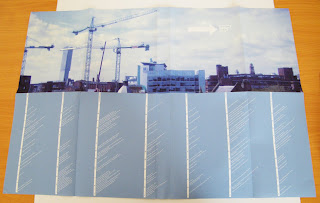
So, most of my design decisions were based around making it accessible and as easy as possible to navigate, highlighting the links between different things. I did separate bitesize books for each section, with titles down the edge of the pages so it could be 'flicked through'. Then I used fold out pages so that I could show the key points clearly, meaning the tutors don't have to read the full write up to see the significance of that topic, with the in depth writing underneath.
As my cover, I decided to use an image I took from the studio, which is where I've spent most of my time this year and also to represent getting out into the big wide world. I designed a rating calender overview type thing of the whole year also on the poster for a quick summery that could be folded out and viewed alongside the books to help contextualise the year.
I have put a lot of work into this journal, going all out for the final year, but was careful not to neglect my other work or spend too much time on it. However, the journal is worth half of our practical work this term so I think it's worth the extra effort! I think I might even miss doing the journal when we leave, dare I say it!


No comments:
Post a Comment